skip to main |
skip to sidebar
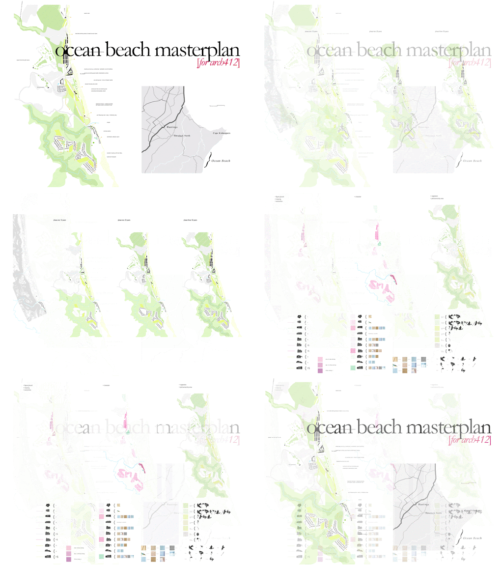 a group project undertaken to design a masterplan for the proposed coastal community, ocean beach in hawkes bay. the design envisions three phases which allows a gradual build-up of physical elements on the previously untouched site (currently home to a community of holiday baches).
the first phase proposes a rehabilitation institution in the northern part of the site to establish economic and population opportunities, as well as some initial housing in the southern area of the site. the second phase sees the institution become converted into a central 'town' area, where the building itself can provide residential and/or business opportunity. the central area of the site is able to become a school for local children and effectively connects the previously disconnected halves of the larger site. housing is increased in two different degrees of density in north and south areas accordingly, and continues into the third phase.
the idea for the masterplan is based in creating diversity and subtlety in creating a new community on a greenfield site. the site's existing role as a popular holiday destination is a priority to be maintained and with the split placement of intense development, the main beach is able to retain its idyllic character.
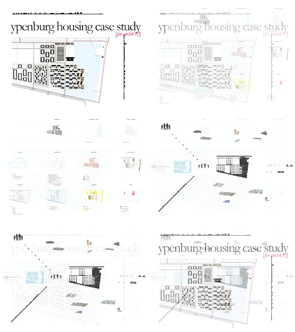
 a graphic analysis on the dutch housing plan for ypenburg.
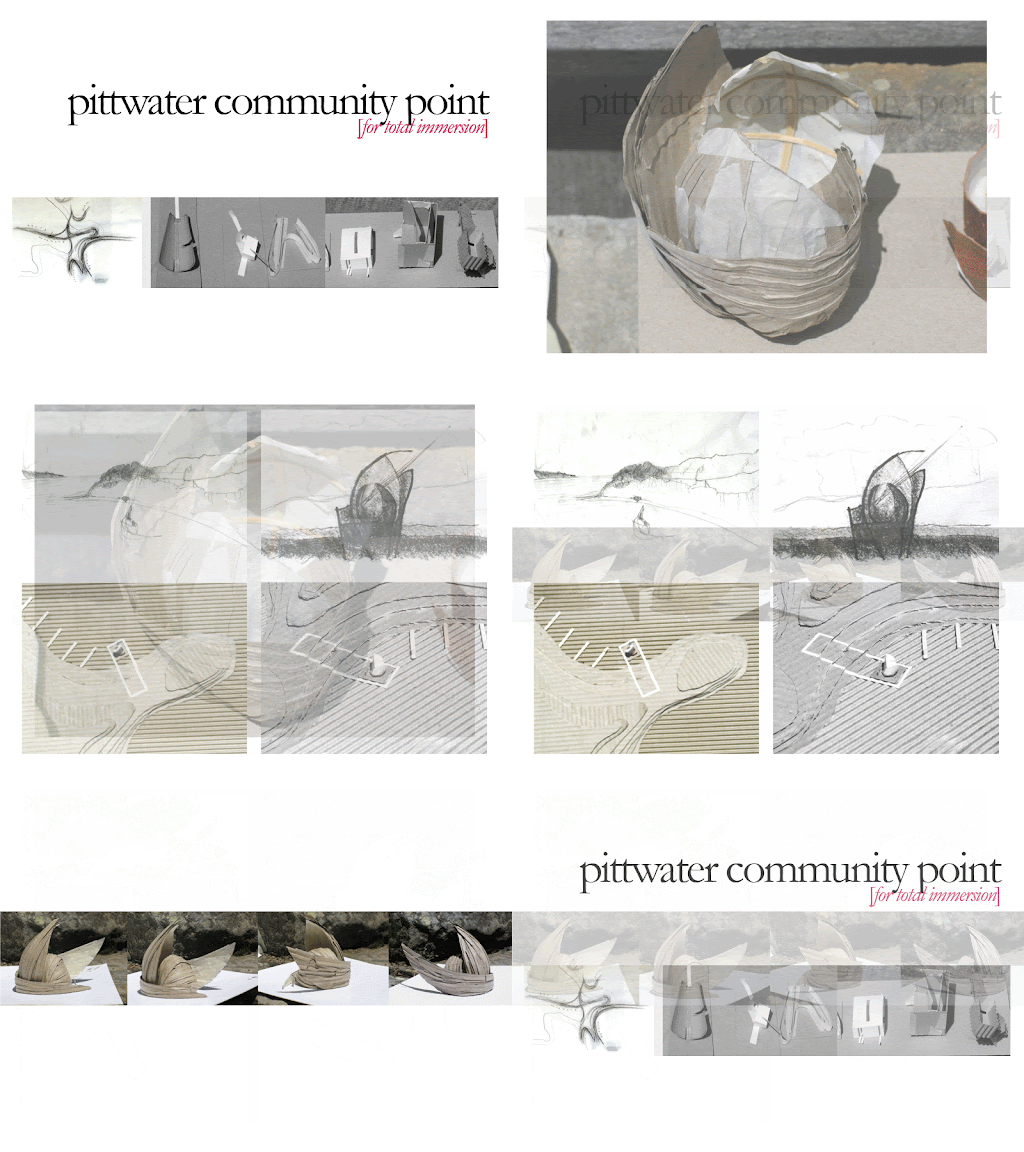
 a group project undertaken at the Total Immersion Summer School in Pittwater, NSW, taught by Richard Leplastrier, Peter Stutchbury and co-ordinated by Lindsay Johnston. the brief for the project was to create a central gathering point for the surrounding Pittwater community. discussion led to a 'building' to be created on the water, to enjoy views back to the land whilst being immersed in what is the connective fabric of the area: the water.
the gently curved and enclosing structure is intended to be approached by kayak or swimming; where to inhabit the inside is to experience a dazzling space created by the reflections off the water and again reflected between the architectural elements clad in a perforated thin sheet metal on the interior (with a sail cloth membrane on the exterior).
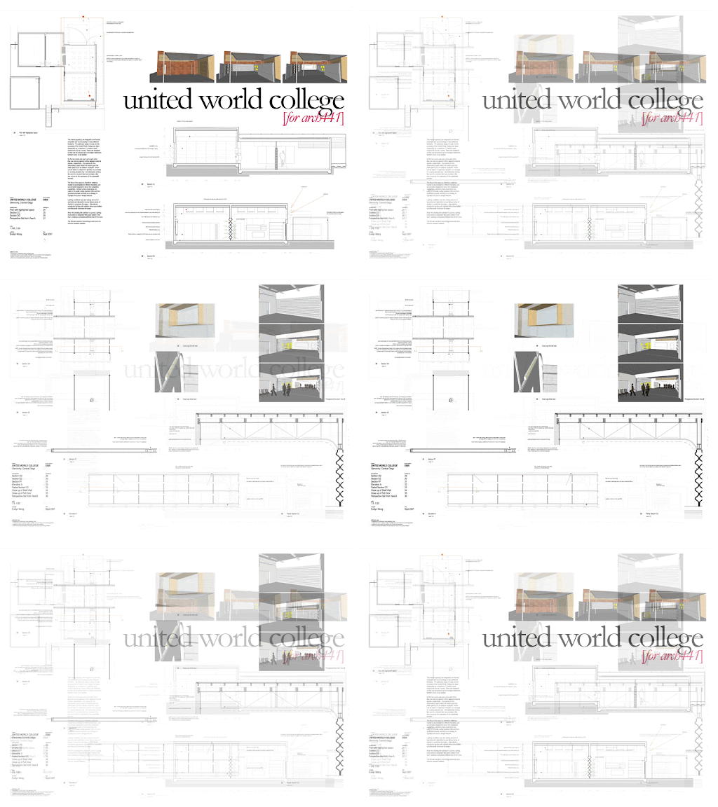
 a detailed portion of the united world college project (as below). the adaptability between room spaces was explored here where two smaller classrooms could be combined to make one larger one.
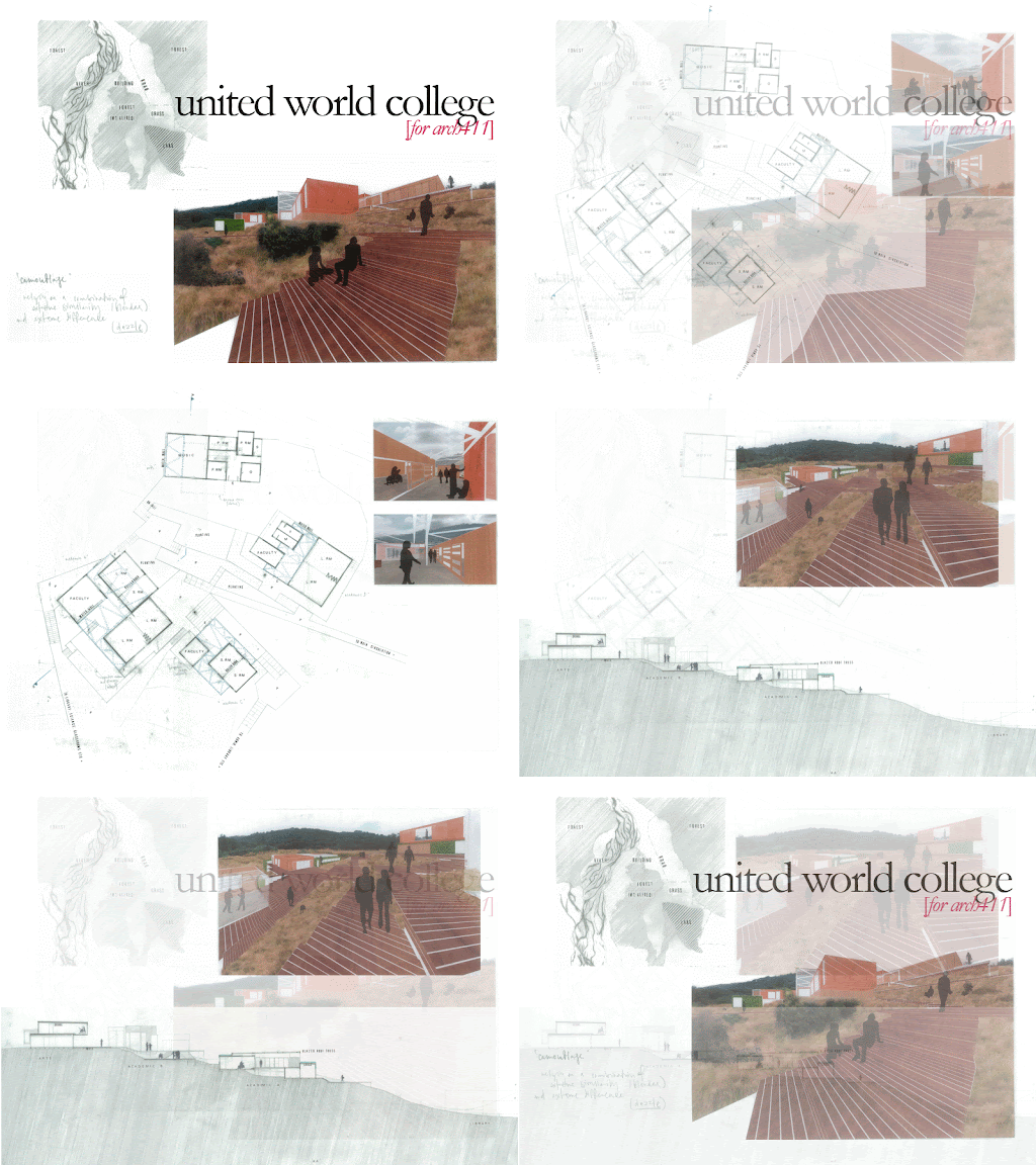
 the site for the united world college project is in idyllic glenorchy (just outside of queenstown), where its large amount of program (e.g. classrooms, accommodation for staff and students, recreation center, library, canteen, etc) demands much of the untouched site. a 'camouflage' strategy was therefore adopted where the idea is that camouflage relies of a combination of extreme similarity and extreme difference.
this was achieved by creating a framework of criteria which each individual building had to conform to, e.g. in each elevation there were to be three planes of depth to assist a three-dimensional appearance; there were to be three stratas of material applied (bottom strata: green/planted facade; middle: timber-clad; top: copper-clad), etc.
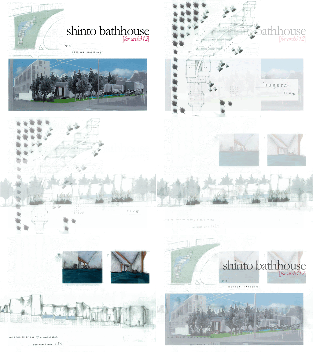
 the 'shinto bathhouse' is a response to a brief which asked for an architecture based in ritual. the Japanese religion, Shinto, is one that speaks of everyday living as well as exercising the celebration of particular events which occur in a person's life. the everyday ritual of clean(s)ing oneself is important to Shinto culture and is one that is not as celebrated in much Western culture, let alone New Zealand's.
by inserting this shinto bathhouse alongside the newly-created Wellington bypass, a resulting tension is created where the placement of the architecture's volumes suggests an intense slowing-down, countering the constant movement of vehicular traffic.
as the use of the bathhouse is ritualistic in itself (changing; cleaning; then bathing - in gradually hotter temperatures of water; then tea or massage) program is placed accordingly. it effectively creates a linear experience of site and ritual; while the planting of the site acts as a secondary buffer to the insistent bypass and the hard nature of the city.
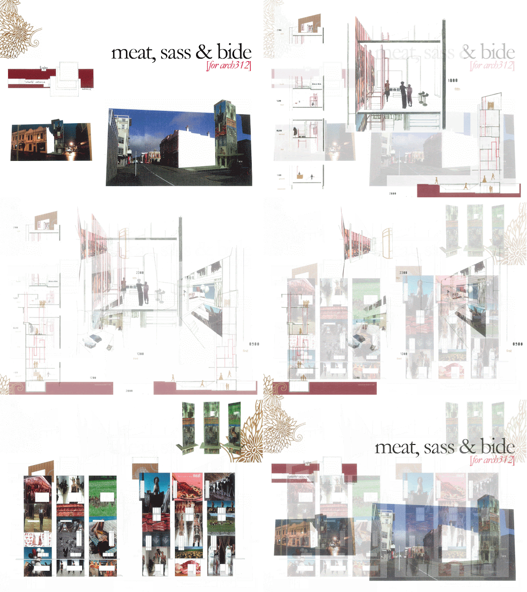
 the brief for this project was to design 24-hour architecture. 'meat, sass & bide' combines a butchery and a clothing boutique (for australian clothing label 'sass & bide') to exist together and also as themselves according to different times in the day. with an increasing residential population anticipated in the area, this project foresees extended retail opening hours which also seeks to enliven the area past 6pm.
encased glass display units extend between floors to allow a crossover between the display of clothing and meat products. it, in turn, creates a void in the floor which extends the visual relationship between floors and program.
a large segment of public space in front of the 'tower' incorporates an outdoor fireplace which is a reflection of the existing fireplace in neighbouring Bresolini. the presence of this domestic object creates a signal to the architecture's critique of the domestic identity of the female and the body as played out within the architecture and the objectification of clothing and food.this project was shortlisted in the designboom.com 'the skin of corian®' competition (within a list of 124 from 3006 entrants from around the world) for the use of corian in the triangulated- and rotating facade elements (see http://www.designboom.com/corian2006.html/)

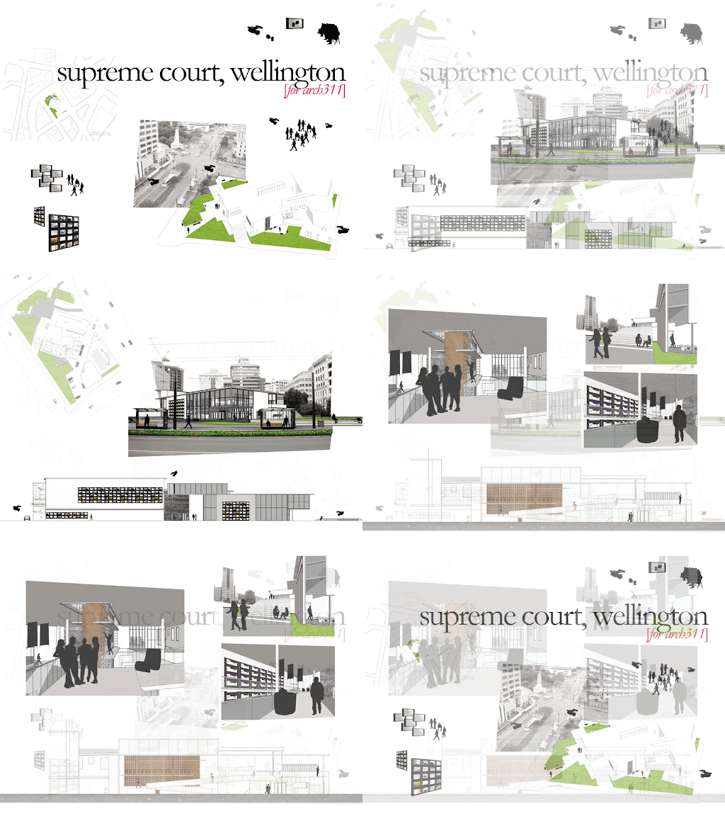
the brief to design a new supreme court prompted a site visit to the existing courts in wellington. the presence of CCTV in these courts, alongside the inherent nature of the judicial system, led the design to incorporate television screens as an architectural element.
they alternatively displayed: court proceedings; circulation paths; other programs within the building (e.g. library, cafe, etc); the exterior park spaces; as well as, what was happening on the other side of the screen (e.g. as a window). to invigorate the 'see and be seen' approach, it was a priority to incorporate public space within the site and building itself. For example, the foyer to the supreme court is designed as a gallery space; while the exterior space maintains its previously-existing park quality to continue as a popular lunch-spot.
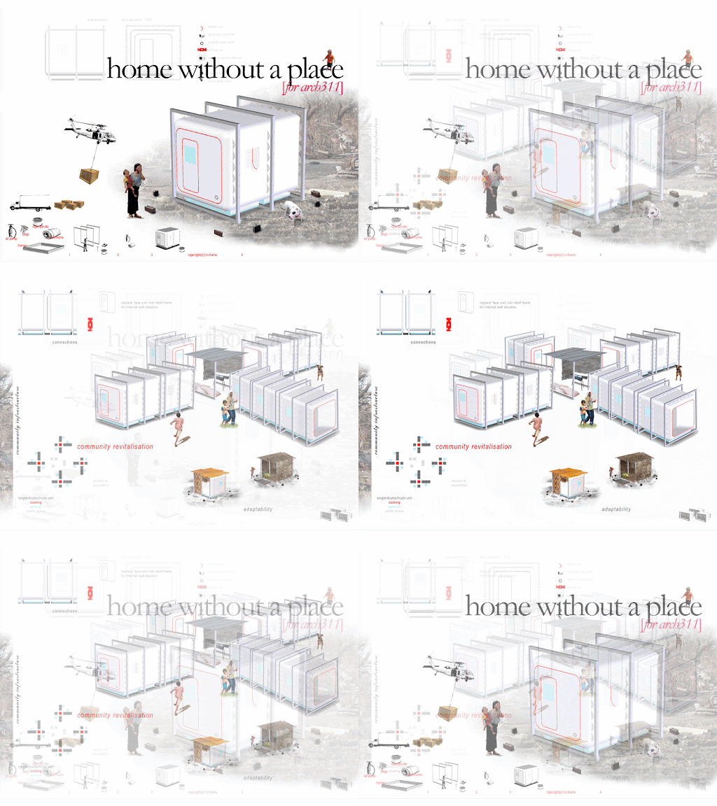
 'home without a place' considers a design opportunity for post-disaster housing. based on a kitset (and therefore easily relocatable) design, it is composed of five elements: steel RHS frames with interior loops; inflatable main body; pump; pegs; and rope.
the inflatable main body is pumped up, attached to the frames with the rope which are, in turn, attached to the ground by pegs and rope. once it is taut, the main body no longer needs to remain inflated.
the design allows modular arrangements according to community and/or family customs; while providing the basic elements required to make a shelter. disaster survivors can therefore use the elements as they wish to create a temporary shelter they can feel comfortable with.

![evelyn wong [for blogspot]](https://blogger.googleusercontent.com/img/b/R29vZ2xl/AVvXsEhFIUGCL8Yb0MIC4zeLJtVJ38lqt5cgqLngAlSmAyU_oFwTba8FG5YablxJ2O97AtKUiJhnS5J4bniZVq8dqxV-zh7TwWCsf4CuyYlk2oYRuB7beiiVCJg18L6KSwhhMaxeOrXQ2fPdtPCh/s1600-r/blogheader.jpg)
